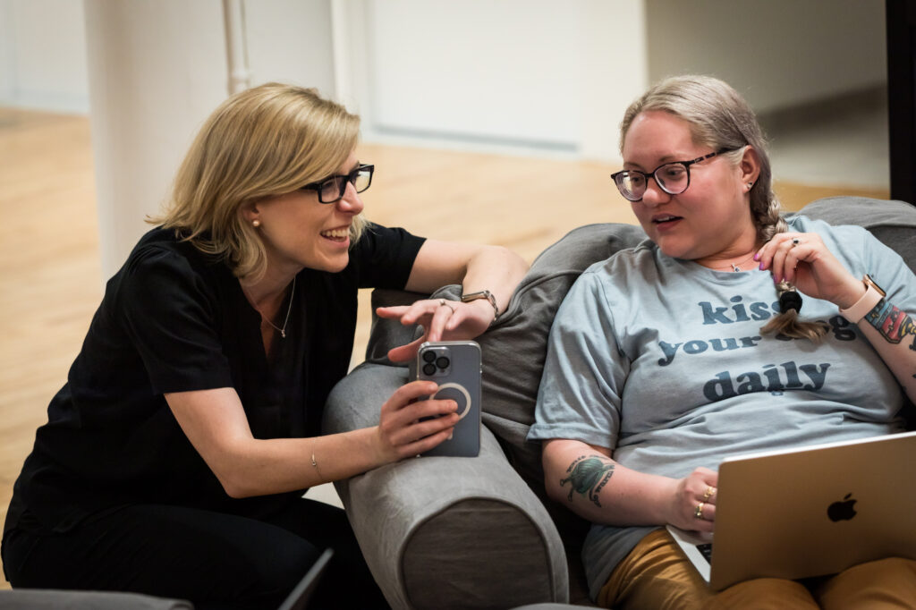
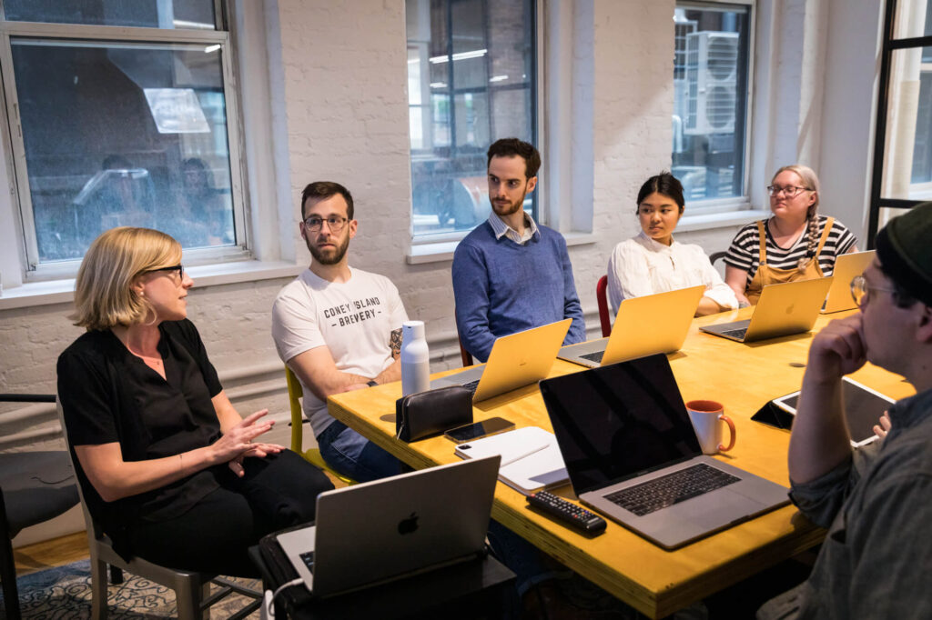
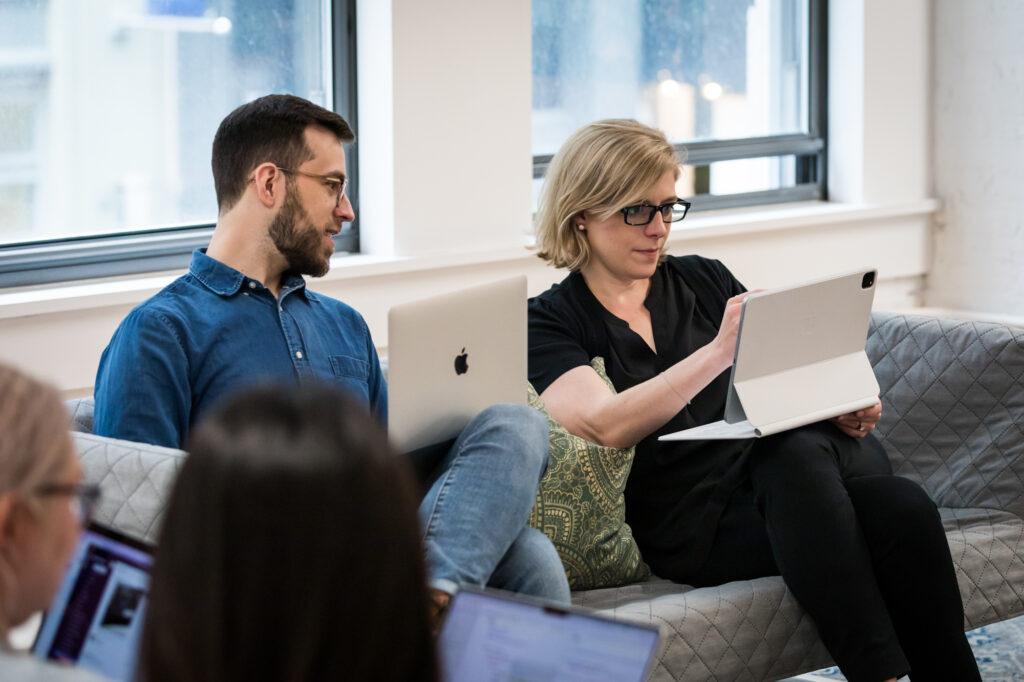
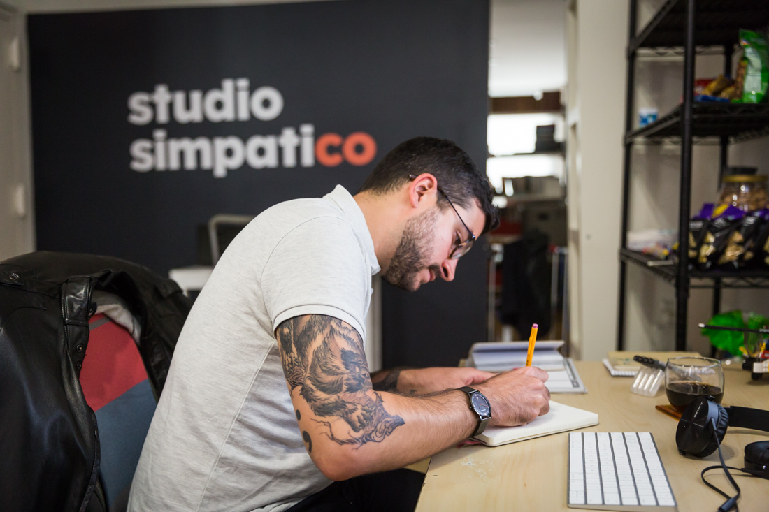
 hi, i'm
In Art class, my Kindergarten teacher Mrs. Cooperson had us follow a simple and methodical approach to creating drawings:
- Lock down an idea.
- Create a pencil sketch.
- Draw over it in pen.
- Choose some crayons.
- Color.
- Voila! Ready for fridge prime time.
By requiring teacher sign-off before allowing us to proceed to the next step, Mrs. Cooperson saved our class a lot of time and paper.
Three decades later, Studio Simpatico’s process for creating digital products mirrors what I learned from Mrs. Cooperson. Below, learn more about the steps we take when tackling UX and product design challenges.
Step One: The PRD (lock down the idea)
In Kindergarten, my goal was to draw something that would make Mom so delighted that my drawing would end up on the fridge. That was my business requirement. To fulfill my business requirements, I might decide to draw a beach (because Mom loves the ocean).
These days, we call the plan of what to build the PRD (Product Requirements Document). The PRD bridges business requirements and design: it articulates exactly what will be built and why, and brings the team together with a shared vision of the product, general functionality, all its features, and high level user flows. A PRD may also indicated what is MVP (minimum viable product — a/k/a which features need to be in the first release of the product), vs. which can be postponed for later.
Some clients come to us with fully baked PRDs. Others hire us to help them write it. Either way, we love using Google Docs so we can work collaboratively through the requirements. For great details about writing a PRD, we’d encourage you to check out Martin Cagan’s How to Write a Good PRD.
Step Two: Site Map (the pencil sketch)
Once we received approval on our plans, Mrs. Cooperson cleared us to grab pencils to begin our masterpieces. The pencil’s eraser ensured that our inevitable mistakes could be rectified with minimal effort.
The site map is a rough, highly zoomed out deliverable that we begin once the client signs off on the PRD. A site map shows the overall flow and makeup of a website or application. Check out an example site map/user flow for a mobile app we designed, Versed.
During this phase, we love thinking in broad strokes and working collaboratively and creatively with our clients. This usually involves 2-3 rounds of revisions based on feedback and collaborating with key stakeholders until we arrive at a site map that we feel accurately captures the correct user flows and business requirements.

Step Three: Wireframes (the pen drawing)
Generally speaking, our UX process is about starting with the lowest level of fidelity, locking in decisions, and then zooming in to flesh out the nitty-gritty details. Once we know the overall flow of the interface and how all the screens fit together, we zoom in to create more detailed, annotated wireframes outlining the information hierarchy, functionality, and directional guidance for each screen. See how the site map evolved into wireframes for Versed. Again, this phase typically involves a few collaborative sessions and rounds of feedback with the client.
Step Four: The Visual Framework (choosing the crayons)
Mrs. Cooperson’s verbal approval of my pen drawing meant it was time to sprint to the front of the class to pick out some crayons.
For Simpatico, when the wireframes are finalized, that means it’s time to start thinking about the visuals: typography, sizing, colors, and all the other components that make up visual design. We typically mock up two to three critical screens and work with the client over multiple iterations to develop a style that feels in keeping with the brand’s personality and visual identity.
When the visual language has started to take shape, we typically codify elements and decisions in the form of a visual style guide.
Step Five: Visual Design (coloring)
The final step? Applying the visual language from step 4 to all the screens, details, and microinteractions outlined in the wireframes.
Note that we prefer to use Sketch for product design, which allows us to effortlessly create robust documentation for developers along with prototypes to illustrate any animation, interactivity, or microinteractions. (If you’re interested in learning more about why we prefer Sketch, check out our blog post here.)
See the final designs for Versed to better understand what happens when a style guide is applied to wireframes